Thursday, 2 December 2021

Now available

Vivian Ridler, Diary of a Master Printer. A year in the life of the Printer to the University, Oxford. Edited and introduced by Colin Ridler. Oxford: The Perpetua Press. Forthcoming April 2022.

234 x 156 mm. Pp. 304. 16pp. plates. Set in Adobe Caslon and printed in two colours. Sewn hardback, head and tail bands, ribbon register. D.w. £25

With a Foreword by John Randle.

From the prospectus:

‘In 1970 one of Oxford’s great institutions, Oxford University Press, was in crisis – beset by financial woes, management infighting, industrial strife and a technological revolution. This previously unpublished, vivid diary gives a no-holds-barred insider’s account of a critical year. Vivian Ridler, as Printer to the University, was at the heart of a major part of the business, the Printing House…he writes candidly of the challenges he faces from powerful unions and ever more demanding publishing colleagues. His acute and often humorous observations bring the story alive. And as a man of wide interests and tastes he meets leading figures: Philip Larkin, Helen Gardner and Michael Holroyd from the world of literature, great typographers like Brooke Crutchley, Will Carter and Berthold Wolpe, historians like Alan Bullock and Robert Blake, heads of Oxford colleges and the Bodleian, politicians and captains of industry. As a board director he gives frank advice to the Oxford Playhouse and Oxford Polytechnic. He makes elaborate 8mm films, watches a Peter Brooke production at Stratford where the director ‘wrestles with one Bill Shakespeare’, and celebrates the first night of Elizabeth Maconchy’s opera The Jesse Tree, with a libretto by his wife Anne. With an extensive introduction and footnotes provided by the Editor, the diary will be of interest to anyone who loves Oxford and its rich past, or seeks to learn about or be reminded of a bygone and pivotal era.’


Monday, 5 July 2021

Harrilds wood letter catalogue

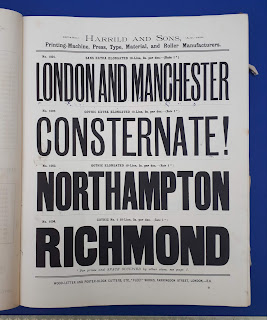
HARRILD & Sons [Printers’ suppliers] New & abridged specimens of wood-letter, corners, borders, &c. ‘Fleet’ Works, 25 Faringdon Street, London EC. N.d. [c.1890]. La. 4to. Page size 310 x 245mm. 2 leaves of prelims & 140 leaves of specimens printed one side only. 8 leaves of two-colour designs shown in 10-line, four to the page, and six leaves of double-page specimens of two-colour designs, shown in various sizes.

Approximately a dozen pages (including two of the pages in colour) written on by a child in pencil, black crayon, and occasionally blue ink. These marks, though distracting, seldom stray into the image area. Orig. brown cloth gilt, front board buckled at some point, worn and stained, torn remnants of an informal paper cover sticking to front and back. Inner joints weak. Lower free end-paper frayed at foredge. The case sound.

A rare nineteenth-century wood letter catalogue complete as issued and for the most part internally clean and bright. SOLD 


Friday, 2 July 2021

Edward M. Catich

CATICH (Edward M.) Letters redrawn from the Trajan inscription in Rome. Davenport, Iowa: Catfish Press, 1961. 2 vols. 8vo & sm. folio. Pp. xii, 45 + title and 94 loose plates (32 x 19cm) in a portfolio, qtr. cloth, printed labels. Very good. Scarce. £225

'In 1936 I was given permission to erect scaffolding in front of the inscription, and from this scaffolding I made photographs, measurements and rubbings...The letters, signs and marks in this portfolio are meticulously and carefully copied from those rubbings.' p. 35


Friday, 4 June 2021

Russell Maret

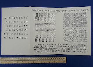
MARET (Russell) Visionaries & fanatics, and other essays on type design, technology and the private press. Ann Arbor: The Legacy Press, 2021. 254 x 175mm. One of 250 copies in cloth, with a letterpress type specimen printed by the author. Pp. 143. Numerous illusts, many in colour. Yellow cloth. D.w. New. £68


Friday, 14 May 2021

Edward Johnston's type for the London Underground

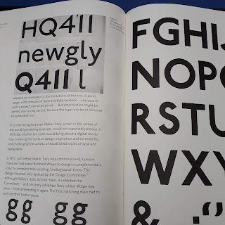
BANKS (Colin) London's handwriting. The development of Edward Johnston's Underground Railway block-letter. [London:] London Transport Museum, 1994. [One of a limited edition of 160 copies]. Large folio. 510 x 373mm (size overall 55 x 41 cm). Pp. 50 printed on 225gsm Zerkall mouldmade paper by Libanus Press (letterpress) and Senecio Press (offset litho). Text set in New Johnston. Numerous illusts including reproductions of Johnston's original drawings and 17 pages of type specimens printed from original woodletter. Orig. blind-stamped red cloth, black cloth clamshell box, by Smith Settle. Fine. £450

Designed by Banks & Miles for the 60th anniversary of London Transport, this is as much a justification of New Johnston as a history of Johnston's original design. It would appear that only copies issued near the time of first publication were inscribed on the colophon with a number and statement of limitation. This copy has no inscription. A magnificent record of this most celebrated of proprietary typefaces. 


Friday, 16 April 2021

Maximilien Vox

DANEL (L.) [Printers]. VOX (Maximilien) [Intro. & designer] Livret typographique. Établissements typographiques et lithographiques L. Danel. Lille, 1935. 4to. 30 cm. Pp. [iii], xvi, 183, [4], excluding section dividers. Some interior photos of the works. Orig. decorative boards, printed cover label, corners slightly worn, orig. glassine wrapper intact. Inscribed on half-title and rear inside endpaper. Striking title-page and some attractive deco touches in the geometric borders and tartan-like cover design. Very good. £175

Though Maximilien Vox (1894-1974, real name Samuel William Théodore Monod) is perhaps best known for devising, 1952-54, the Vox system of type classification - adopted, with some development, by ATypI in 1962, and in 1967 becoming the British Standard - his interests ranged widely, in the fields of literature, art history and publishing, and he had begun his career as a cartoonist, illustrator and journalist before taking up typography and graphic design in the 1920s. From 1928 he edited with A. M. Cassandre the Divertissements typographiques published by Deberny & Peignot. Something of an anglophile (he was partly of British descent), he illustrated a notable edition of Jane Austen, published by Dent, 1933-34.

The type specimen he designed in 1935 for the venerable French printing firm of L. Danel (f. 1698) ends with a four-page outline of the ‘art de reconnaitre un caractère’ according to the (serif-based) ‘principe de Thibaudeau’. The types preceding are arranged by Vox as follows: ‘caractères anciens’ (Venetians and Old Face), ‘modernes’ (mostly recent typefaces of a broadly transitional character), ‘classiques’ (Didones), ‘antiques’ (sans-serifs) and ‘divers’ (pretty much everything else, including slab-serifs, scripts, blackletter, non-Latins, etc.).

As he says in his introduction, ‘Je ne sais pas d’occupation plus charmante’ than leafing through a type specimen book. Who could possibly disagree with that?


Thursday, 8 April 2021

Edward Johnston's type for the London Underground


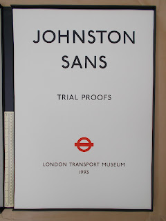
[JOHNSTON (Edward)] Johnston Sans. Trial proofs. [London: I. M. Imprimit for] London Transport Museum, 1993.

   Privately printed in an edition of 14 numbered sets (4 on dampened Zerkall mould-made paper, 10 on cartridge), together with five sets, A-E, designated printer’s proofs.
   Broadsheets (25 ¼ x 17 ½”, 640 x 445mm) printed one side only. Title-page, edition details (colophon) and 25 sheets of type specimens. Sheet 1 shows the three sizes of cast metal type that were produced from Johnston’s design by Stevens, Shanks in the 1920s, and is printed from original foundry type. The remaining 24 sheets show wood type from 5-line pica to 24-line pica and are all printed from original wood type. Unbound sheets loose in a Solander box lined with beige Hannemuhle acid-free paper and covered in black Library buckram, printed label.
   Printer’s set D printed on cartridge paper, including additional items from the printer's archive as follows:

1  Early trial proof of two alphabets (10-line Pica and 8-line Pica) to check the condition of the wood type before printing began.
2  Early proof of 5-line Pica Medium and Bold printed on Moulin de Gue mould-made 300gsm paper to present to London Transport as a sample of how the wood types might be presented for the archive.
3  Proof of printer's first suggested text for title-page using 10-line, 6-line and 5-line pica wood type. The wording was revised and the title-page not used.
4  Grid overlay used as a guide to achieve optical centreing. 
5  Trial proof for Sheet 12: 12-line Pica Bold, with compositor's notes on spacing.
6  Two discarded sheets from first printings, containing wrong founts, which are explained in the list of archive material included

This is the last printer's archive set available for sale. £6950 

This private edition, of which only a single copy is in a UK public collection * – that donated by London Transport to the Johnston collection at the Ditchling Museum in Sussex – was designed to provide London Transport Executive and the London Transport Museum with a definitive record of the extant founts of the type designed by Edward Johnston in 1916 for London Underground. It shows this most celebrated of proprietary typefaces in its original form as it stood towards the end of the letterpress era, before Berthold Wolpe’s (unadopted) italic of 1973 and Walter Tracy’s amendments of 1974, and prior to the comprehensive re-evaluation and recreation of the face in the 1980s by the design consultants Banks & Miles, which resulted in New Johnston, still in use today.
   The proofs here were for the most part made from the collection of Johnston Sans wood letter originally held by the printers Howard Jones - one of four London printers who once maintained stock of the type – supplemented by some material from the London Transport Museum.
   A detailed comparison of the different printers’ holdings was impossible by the early 1990s. However, some information concerning the Bournehall Press collection was available to the printer, and London Transport specimens (albeit incomplete) of the stock of the two other printers who had held Johnston Sans, Roystan and Waterlow & Sons, were found and consulted. All this tended to confirm that the Howard Jones collection (now in the Department of Typography & Graphic Communication, the University of Reading) had survived in unusually good order. The process of ensuring the authenticity of the specimens and the exclusion of such wrong founts or poorly made sorts as may have been present in the cases, was aided during the printing by the assistance of Tim Demuth, an experienced user of Johnston Sans, from London Transport Advertising and Publicity department.
   These are authoritative proofs of a true design icon, arguably the first modern sanserif, and one of very few typefaces to enjoy widespread public recognition, and indeed affection. Johnston Sans is acknowledged today as embodying one of the most successful corporate identities ever created.
*Two copies are now in US libraries, the Houghton Library and Dallas Public Library, and there is a copy in the Lettering Archive, San Francisco.

   Justin Howes, Johnston’s Underground Type, Capital Transport Publishing, Harrow Weald, 2000
   Colin Banks, London’s Handwriting. The development of Edward Johnston’s Underground Railway block-letter. London Transport Museum, 1994
   Simon Garfield, Just My Type. A book about fonts. Profile Books, London, 2010, Chapter 8, ‘Tunnel Visions’, pp.114-128.


Thursday, 18 March 2021

Lorimer & Gillies

LORIMER & GILLIES [Book, Law & General Printers] Specimens of our printing types, headpieces, ornaments, &c. 31 St Andrews Square, Edinburgh, n.d. [c.1905]. 8vo. 23cm. Pp. 244, 247-78, almost certainly as issued. Excisions affecting two leaves in the section of book founts (pp. 135-76): a quarter page at pp. 161-62 and a half page at pp. 173-74; one minor excision at pp. 209-10. the cut affecting the following leaf. Otherwise in very good condition. Orig. brown cloth gilt, red edges. SOLD

Notwithstanding the mutilations a most attractive printer's type specimen largely devoted to jobbing and 'bill' types. Much of the material is labelled with the foundry of origin, Miller & Richard principally, together with Stephenson Blake, Sir Charles Reed & Sons, Caslon, Figgins, Austin Wood, and three late C19 electrotypers, Morton, Walker and Wesselhoeft. Includes some woodletter and a wide range of decorative material. With the book label of J. A. Birkbeck who gave the only other copy I can trace to the late Peter Isaac: it's now in Durham UL. Appears to be the most extensive specimen from this firm recorded.